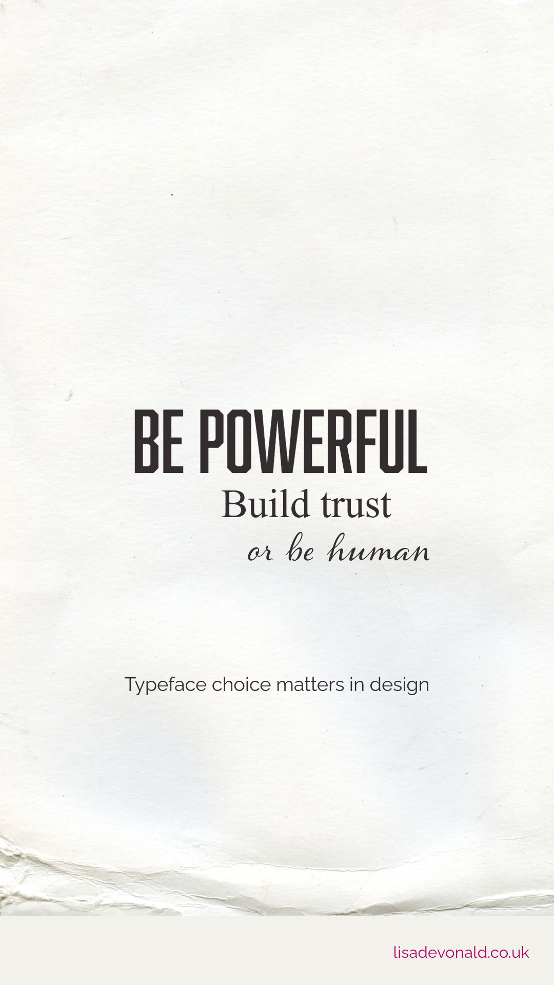
Never underestimate the power of typography
I love writing in the depths of night while everyone else is asleep. Sometimes the words flow into my mind carried by wild streams that twist and turn. Sometimes they are honest, sometimes they dream or question or hope, but sometimes I just like to write to see the words scratched onto the page (ok, onto my iPhone notes app but it sounded so much more poetic that way!).
Letterforms are like mini structures of personality and meaning, clustered together like characters in a story.
Sometimes it’s not about the words themselves, it’s just that they exist…and that before I decided to write them they did not, but now here they are looking back at me from the page as we meet for the first time.
Our typography lecturer at university had a big impact on me, she taught us that words and letterforms can have power and personality. I’d never thought of that before. I listened intently as she opened our eyes to how meaning can be conveyed by choosing the right typeface for the word, the headline, the story, the poem.
Some typefaces stand bold and proud and demand attention, others peacefully articulate themselves with grace and purpose.
‘Read, read, and read again’ our typography teacher urged us, ‘understand the words you are conveying in every design project…you hold the power of true communication in your visual choices.’
When typography is used sympathetically and with true understanding of the words they represent, typography can help make people laugh, cry, reminisce or stand up and be brave in a world where it’s tough.
Never underestimate the power of typography in your visual communication.
‘Ruth’ I think our lecturers’ name was, I’m grateful to her.